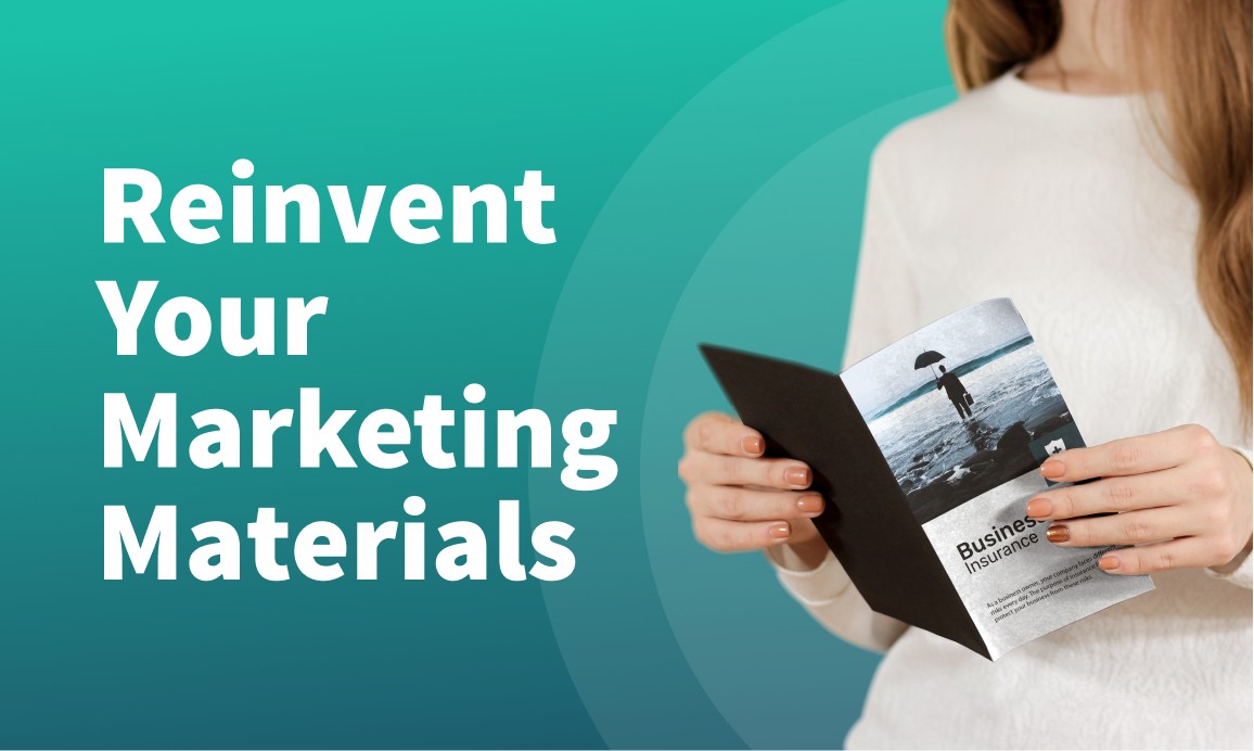
Insurance marketing materials have a big impact on your business. A good piece of marketing content can grab someone’s attention, teach them something new, and make them realize they need your services NOW.
There are many tried-and-true marketing materials — mail marketing, coupons, billboards, booklets, eBooks, social media posts, etc. Brochures are another.
Brochures, in particular, have been a favorite in the insurance industry for decades. However, just because they are old doesn’t mean they are out of fresh tricks. A good insurance brochure is educational, persuasive, and subtle simultaneously. It can answer questions your leads don’t even know they have and sell them on your policies.
Below is everything you need to know to create such an insurance marketing brochure.
What is an insurance marketing brochure?
Put simply, an insurance brochure or pamphlet is magazine-style promotional material that covers the “ABCs” of your insurance services. You would typically expect to see the following things in an insurance brochure:
- Background on the insurance company being advertised
- Statistics or facts about the insurance company (like the number of policyholders, for example)
- An overview of the insurance company’s policies (for the sake of being concise, most brochures only include price and major policy features)
- Images and infographics
- Testimonials and case studies from satisfied clients (or horror stories from people who weren’t insured)
- Educational information
Thirty years ago, most brochures looked identical — they consisted of a tri-folded piece of A4 paper with six sides of information. Today, no two brochures look the same. Some brochures use A3 paper, others fold out flat into a large poster, and some come in book form. Many posters are now also digital.
How you choose to design your brochure depends on three things:
- Your company branding
- Your target audience
- Your goals and objectives
Speaking of designing a brochure…
How to design a killer insurance brochure
You wouldn’t allow an untrained insurance salesperson to attend consultations with clients wearing three-day-old clothes and cheap cologne. It would make a terrible impression.
Similarly, brochures and insurance pamphlets can turn leads away from your services and towards a competitor. Marketing materials aren’t something you want to lazily throw together using whatever images and copy are available to you quickly.
So, that begs the question: how do you make an insurance brochure that makes a positive first impression and converts leads to customers?
Here are five tips to follow for an insurance brochure that leads will love:
1. Know your target audience from the get-go
Marketers talk about target audiences a lot, and for a good reason: if you don’t tailor your materials to your audience, you won’t use messages that are persuasive to them.
Audience-tailored content is good content.
To design your brochure with your audience in mind, you’ll need a clear picture of who that audience is. Describing them as the “general public” won’t help you. Instead, you need to think about the general characteristics of people who need your services. For example:
- Age
- Gender
- Education level
- Family structure (single, married, kids, living in a multigenerational home, etc.)
- Location
- Occupation
It might help you to compile this information into a buyer persona — a fictional representation of an average member of your audience that looks like this:
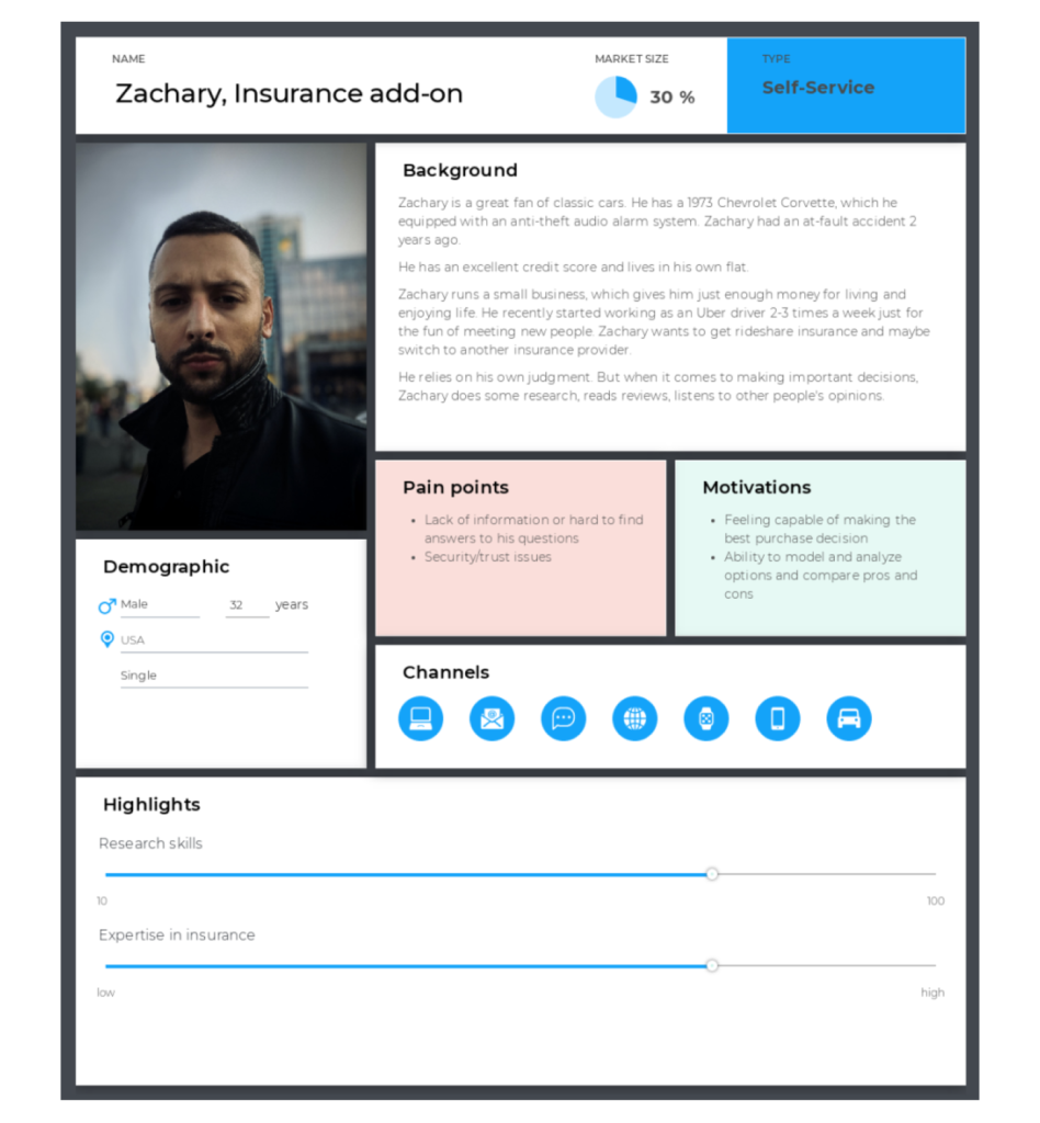
Source: Uxpressia
Once you know more about your audiences’ characteristics, consider their pain points and motivations. Your salespeople speak to customers daily (at least, hopefully), so they should have some useful insights here. Alternatively, you can run a focus group and ask members of your audience directly.
Take their motivations and pain points and try to imagine what would be persuasive to them. For example, people looking for an insurance policy to protect them against theft might find the statement “a break-in occurs every 26 seconds in the US” extremely persuasive.
Alternatively, people looking for pet insurance might be more motivated by a heartwarming story about someone who got their puppy Oscar insurance and saved thousands after Oscar was diagnosed with a hemangiosarcoma three months later.
2. Create compelling and personalized messaging
Brochures are a soft-selling sales technique, meaning they rely on education, information sharing, and subtle persuasive techniques to draw a lead-in. For comparison, hard-selling techniques use confrontational language and pressure to close the deal.
But just because your brochure should be subtle doesn’t mean it can’t be compelling.
There’s a lot of power in language, and you can use it to evoke feelings and a desire for your services. Here are some strategies you can try to make your brochure compelling:
- Ask rhetorical questions like “how would you get to work if someone stole your car?” to get the reader thinking.
- Acknowledge feelings your reader may have with language like “it’s normal to feel anxious about …” or “35% of homeowners worry about break-ins while away.”
- Refer to the reader directly using “you” and phrases like “your family,” “your business,” and “your car.”
- Use reassuring phrases like “InsuranceOne has your back.”
- Try to stick to conversational language wherever possible and avoid business talk (as it can sometimes come off a bit cold and detached).
Now, if you use these techniques too frequently, your brochure may turn people away. Apply compelling language sparingly for best results.
Of course, the copy isn’t the only thing that you can make compelling…
3. Use attractive visuals and interactive images in your content
Your brochure copy is fantastic at selling people your services, but it isn’t always eye-catching. Images and other visuals are, however.
Use at least one image per page for best results, and space your text out carefully with white space. White space is not wasted space, as it draws people’s eyes to vital information and provides emphasis.
If you don’t want to include an image on one page, you can achieve the same effect by using shapes, symbols, and shading. Here’s a template that uses this technique to give you an idea of what’s possible:
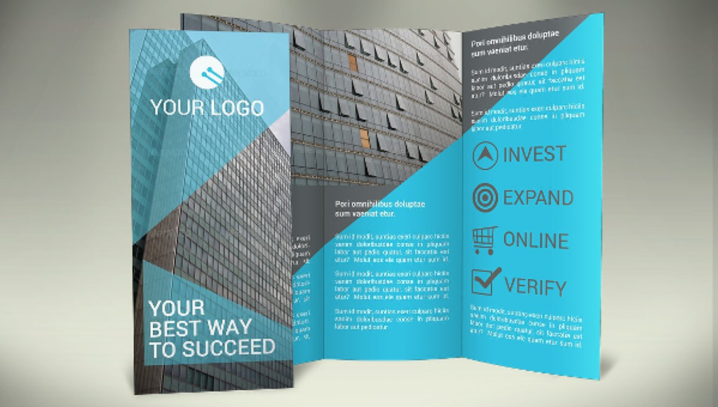
Source: CreativeVivid
Graphs and charts are also helpful — but don’t make them too detailed. Brochures are typically small documents, and if the text is too small, people won’t read it.
If you’re feeling creative, we recommend adding an interactive flowchart that asks people questions and directs them based on their answers. The flowchart format is a great way to help people choose between plans or levels of coverage.
4. Make the brochure design specific to the policy
We’ve already alluded to the idea that boat and pet insurance information doesn’t belong in the same brochure. Pamphlets and brochures have limited space, and you can’t just expand your brochure (well, you can, but few people will read a 100-page brochure about insurance).
To make your brochure as persuasive as possible, really limit the focus of the booklet to only the things a customer needs to know about a single policy. You should also customize elements like your headers, images, and Call-To-Actions (CTAs) so they reflect the policy discussed. Design is also adaptable. If your brochure is on your gold plan, give it a gold tinge, for example.
5. Replicate the process with other policies
Each of your brochures needs to look unique, but they also need to be distinctly “yours.” Branding is powerful, and people react to it. When you read “coca-cola,’ you instantly think of the iconic coke-red color.
To create distinct branding among your brochures, make sure you include your logo, brand colors, and any other branding elements you use (like an iconic title font or photo filter).
Then, create a template you can adapt for each brochure you produce. This template should outline:
- Where images should go
- The fonts you use for H1, H2, H3, H4 headings, and paragraph text
- How big each page element is
- The style of writing you use
- How you format testimonials and quotes
Many design programs will allow you to save this template and simply create a copy every time you need to create a new brochure.
Additionally, standardize the order you present information and each page’s contents. For example: page one = title, page two = what is (topic)?, page three = why (topic) matters, page four = policy options, page five = policyholder testimonials, and page six = interactive chart and CTA.
To make your brochures stand out from each other visually, use a slightly different shade or graphic for each. This difference doesn’t need to be significant — slight tweaks like in the example below are enough.
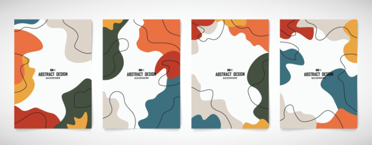
Source:Vecteezy
Take your marketing to the next level with Pathway!
Your insurance marketing materials matter, so they aren’t something you want to take lightly, whether you’re an insurance marketing agency, a local firm, or a national chain. Developing high-quality insurance pamphlets and brochures can help you educate leads, teach them their policy options, and persuade them to say “yes!”
For best results, tailor your brochures to your audience, be compelling, use visuals to your advantage, and make your brochures policy-specific.
Additionally, use Pathway’s marketing tools to help! Pathway’s Marketing Bot can send digital brochures to clients, nurture relationships with them via email, and help you optimize your campaigns with data.
Learn more about Marketing Bot (and Pathway’s other services) by scheduling a 1:1 meeting with Pathway.

Recent Posts
 10 Best Practices Fo…November 10, 2023
 5 Strategies for Eff…July 31, 2023
 7 Ways to Increase C…July 21, 2023
Recent Comments
on 10 Best Triggered Email Campaigns for Insurance BrokersThanks for sharing, it's…
on 10 Best Triggered Email Campaigns for Insurance BrokersI would like to point out…
on 6 Best Ways to Automate Marketing in InsuranceIts like you read my mind…
Leave a Comment